

Herbs, etc is an established supplement brand formulated by a world-renowned herbalist. While their current logo is full of approachable, retro charm, I felt that a rebrand could better communicate both their approachability and their experience along in a visual language that spoke to their commitment to research and technology. This project was completed as an assignment for class at Pratt.

For the logo, I started with a sans serif font as a base to bring a feeling of freshness and modernity to the logo; I then re-drew the letters to soften the look somewhat. The illustration of herbs, roots, and berries below are a nod to the ingredients and natural origin of their products, as well as a subtle reference to the slightly asymmetrical "Rx" of a typical prescription pad.
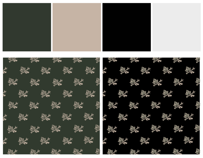
For colors, I chose a more muted, neutral natural palette than the current bright green and yellow. The leaf, root, and berry patterns above are designed to be used as packing paper both for shipments from the online store and for fragile items in their brick-and-mortar location.

The exterior sign with an updated logo and a modern display option such as the one pictured would help to further update and enhance the shopping experience. Pictured below is a reusable shopping bag that could be sold at the register.
Overall, the combination of a softened sans serif typeface with hand-drawn illustrations presented in a more neutral, natural palette brings a modern, professional flair while maintaining the charm and approachability of the current branding.
Overall, the combination of a softened sans serif typeface with hand-drawn illustrations presented in a more neutral, natural palette brings a modern, professional flair while maintaining the charm and approachability of the current branding.


